Funder Labs & The Fragment Factory
Elsevier, 2021
Discovery
Developing a new product meant exploring the target audience and the existing market (competitors, alternative solutions). Developing and following a script to use when meeting development partners meant we could later map our potential users according to size of organisations, fields they specialise in, etc. and analyse the interviews in a way that would allow us to see what common use cases, pain points, other products surface and to define personas.

Looking into what other products already exist in that realm through websites, webinars, tutorials and testimonials help us focus our value proposition, while products that would come up in the interviews help us map what potential users already "agree" to pay for and further research what is "value" for them.
Share-back sessions were held internally within our organisation to communicate our findings from meetings with our target audience to the different stakeholders.
Research
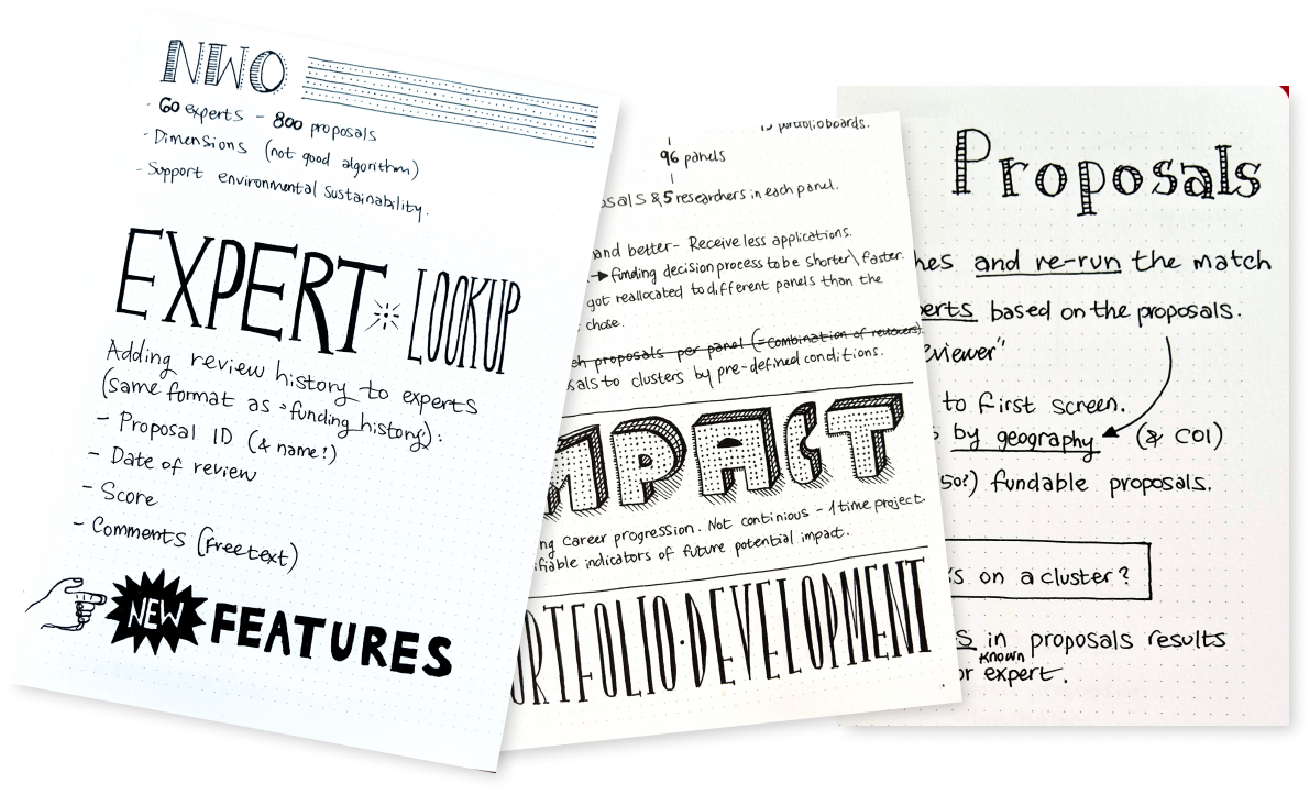
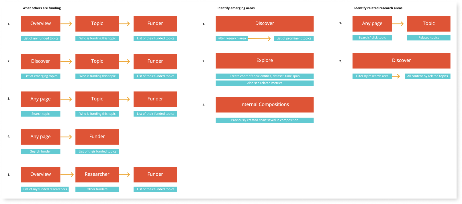
As the research advances, we're getting more precise and focused with each session, sketching user flows along with determining data availability and data quality. The main use of those flow charts and data mappings are used to help align the understanding of the stakeholders around the intentions for this product.
Product owners and Tech leads get a first glimpse of what the product might shape up to be. They can start gathering thoughts around the scope of the project, use the visual material produced to communicate internally in their own groups and build trust that there is in fact value to be provided.
Learnings from discovery
- Different funding organisations owned, collected and required different types and amounts of data.
- Those data were stored, analysed, and applied differently by the different organisations and the different personas within each organisation.
- For one system to serve different users, it would have to be based on modular and editable fragments that can easily and quickly compose a personalised product.
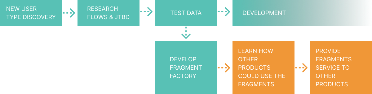
The Fragment Factory
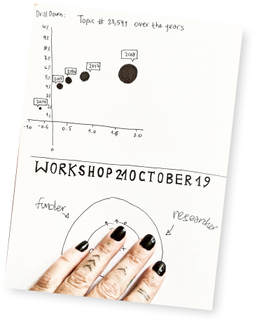
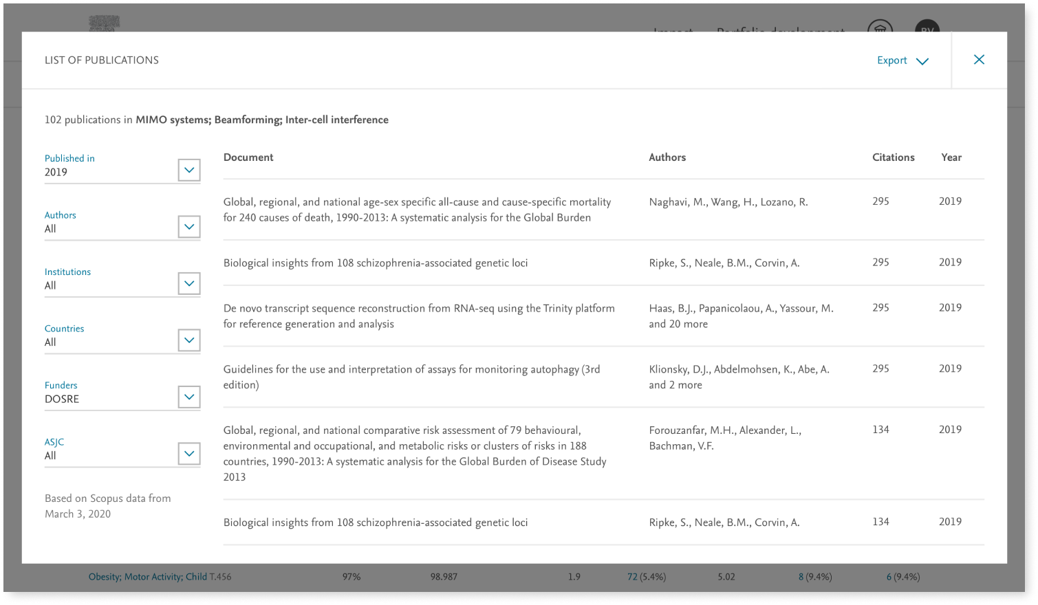
During user interviews, while the visual concepts received positive reactions, it became evident that the information delivery concepts were highly dependent on the quality of the data we could provide to ensure innovative perspectives and actual decision making aids for the users.
Without testing real data, the designs were merely hypothetical.
At the time, applying data to each piece of infographic took one full day of development.
We required a quick way to test the concepts using real data.
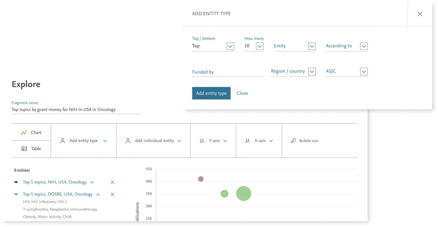
Along with the engineering lead, the P.O. and I initiated a week of design sprint / hackathon that kicked off the production of a Fragment Factory. A system that would allow applying real data to charts and tables in minutes, producing whole fragments of infographics in an interface that enabled users to analyse external and/or internal data and to execute further manipulations of them.
That allowed us to design for real data scenarios, and to validate the users’ expectations and experience.
Product Design
The design of the new product relies heavily on the existing company guidelines + modernising the look and feel to be more airy, clean and flat. Emphasising points of interaction and calls to action as well as the modularity that the concept is based on. This approach is also being implemented in the development of another sister-product, by another team for Institutions.
Internal adoption
In parallel to the discovery and research process of developing the funding organisation product, and after sharing internally, the successful development of the fragment factory - other product teams started showing interest in the new development, and our team quickly after started working with those teams to understand how we can turn the factory into a fragment service that produces infographics and tables for them to be embedded in their products.
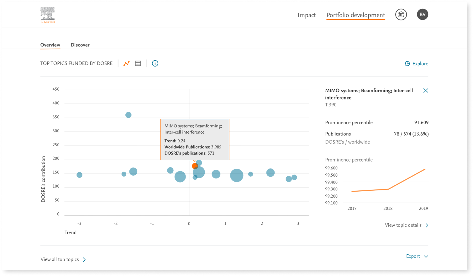
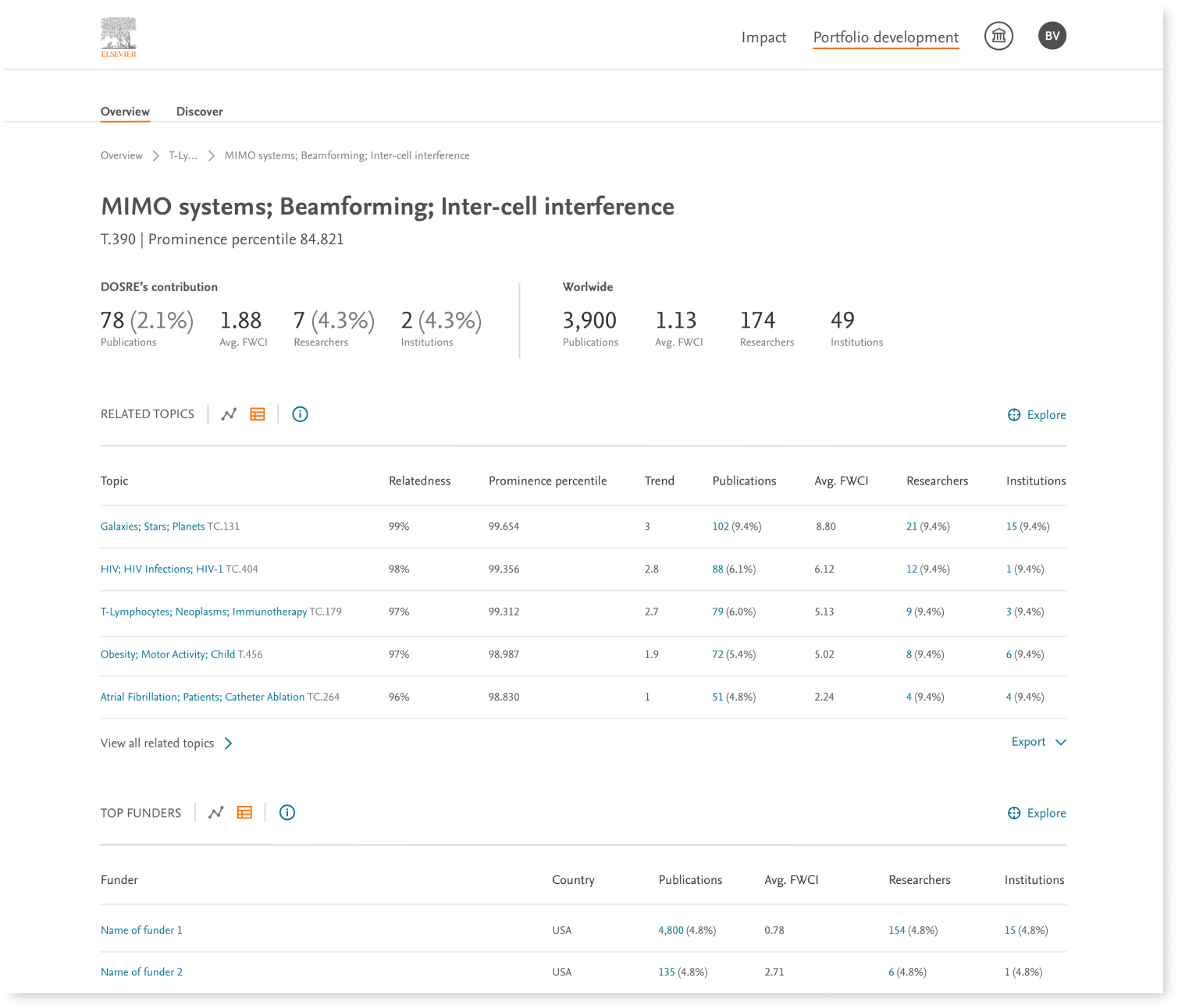
 The fragment factory was now ready to provide a large variety of chart types: Lines, map, scattered, sun burst, pie, stacked bars, table, etc.
We could easily and quickly connect to any local or API based data source.
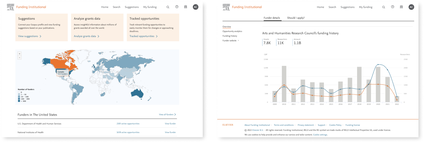
Sticking to the brand guide and UI library from the beginning, as part of the modular approach, meant the fragments didn’t require any visual adaptation for them to be available for other Elsevier products, such as: Scopus, SciVal and Funding Institutional.
The fragments are now delivered to thousands of users around the world.
Back to top